Dashboard Makeovers: Three Redesign Tips
At Strategic America, we strive to “find a better way” in everything we do. As a data scientist and dashboard designer it’s a guiding principal for the work I do every day for SA clients. In the world of data visualization, always striving for improvement, is the driving force behind dashboard makeovers.
Often a dashboard may be put together on the fly for quick data visualization without thought of consumption. Many of the dashboards that we inherit are functional, but lack the design elements that help in easy understanding. Nothing that a little makeover can’t fix.
Dashboard makeovers give us a chance to consider the data and the clients’ needs. It allows seamless branding through logos, company colors, iconography and style. Occasionally, SA clients may have a special reporting need, such as a downloadable, 1-page report with a specific design template.
Dashboard makeovers can also be driven by a new business need such as new locations, new marketing channels and new data sources. This gives SA another opportunity to serve the client and bring their data to life through dashboard visualization.
Redesign Tip 1:
Think about whitespace. The empty space on your dashboard that surrounds all your graphic elements. Whitespace is important when considering design, because it is the frame for your visualizations. Whitespace can also make your dashboards easier to read and understand. It is also a place to introduce color into the background of your dashboard.
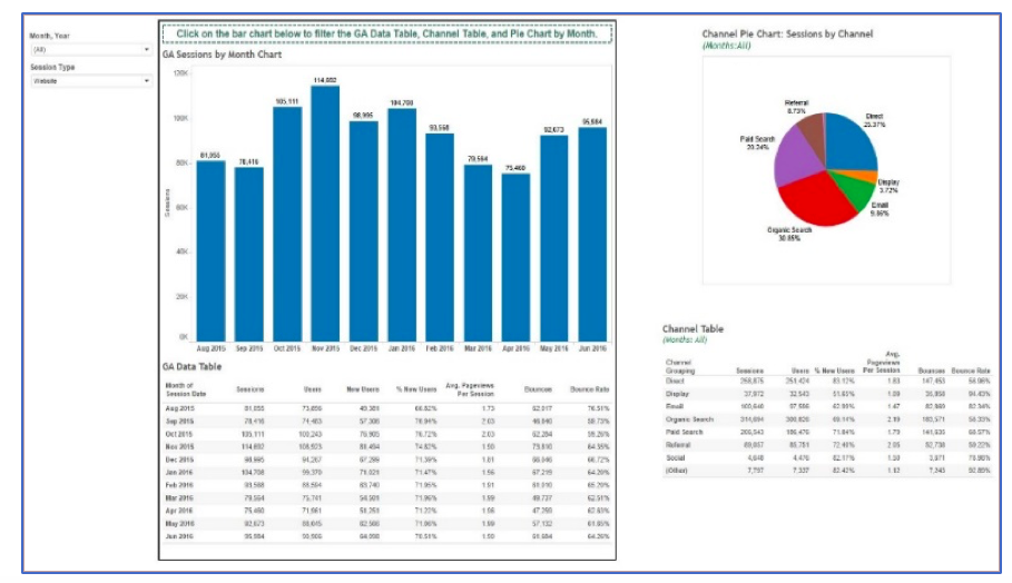
Figure 1: Plain yet functional dashboard.
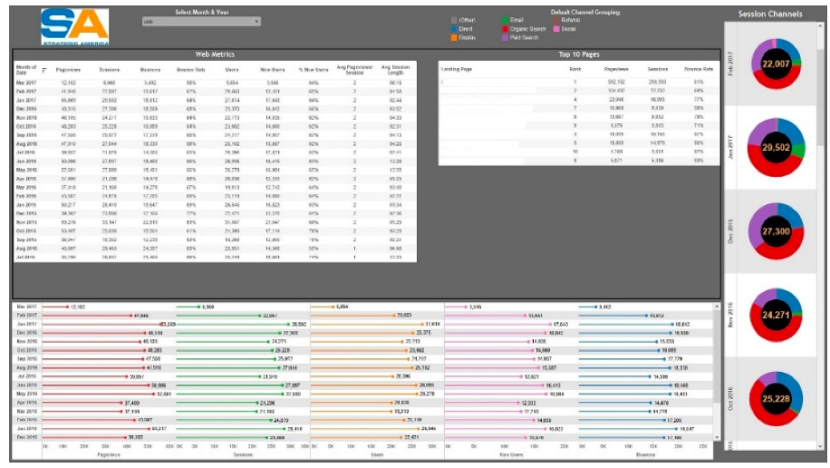
Figure 2: Redesigned dashboard using background color.
Redesign Tip 2:
Think about the data story. Left on their own, numbers are numbers. Wrapping those numbers in context will create a data story. Instead of a data table showing monthly marketing budgets, target market, and percent of budget spend, use a pacing chart to visually display how your budget spend is pacing.
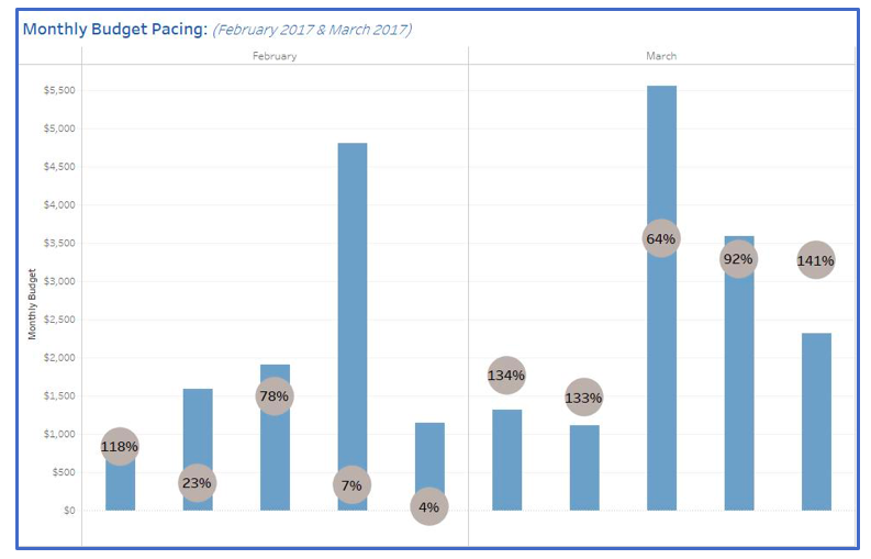
Figure 3: Marketing budget pacing chart.
Redesign Tip 3:
Think about your client’s customers, locations, markets. Now think about that data on a map. Any data that has a location attached to it (city, state, ZIP code) can be visualized on a map. Tip 3.1, keep it simple. Maps have many applications. They can be used as heat maps to discover where sales are strongest, follow a customer journey or to define a trade radius for marketing planning.
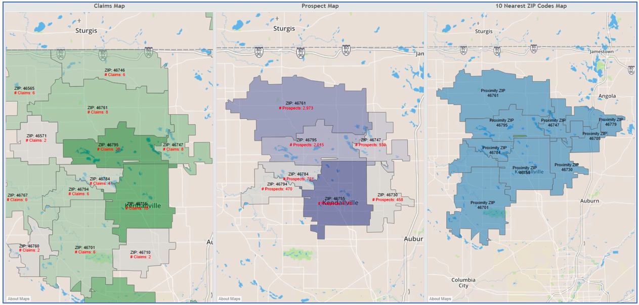
In the example below, ZIP code maps are used to define currently served ZIP codes, prospects in trade area ZIP codes and the closest 10 ZIP codes for the market center. The map on the left and in the center show the strength of a specific KPI by ZIP code based on the shade of color.

Figure 4:Trade area ZIP code map dashboard.
Dashboard makeovers can be an overwhelming process. In some cases it may mean starting from scratch, while in other cases it may be a simple change for branding or new client locations. In any case, the end result should be striving for improvement and helping your clients understand their data story.


